Sunday, 22 March 2015

Photographic memories


Why do we take photographs? A deceptively simple question, but one which I guess would have a number of responses depending on who you are

Maybe your livelihood depends on your ability to take photos? If so then your primary motive would be to make money. For those amateur photography enthusiasts out there, the answer would range from simple enjoyment to being able impress our peers and friends with your skills. 

However for the vast majority of us, I think the simple answer would be in order to capture memories

Recently I have had to clear out my late fathers house. Unfortunately in his later years he resorted to collecting a lot, and disposing of nothing (from talking with friends I think this is not a uncommon problem with elderly relatives). The result of this is that it has taken a considerable amount of time to sort through the clutter. 

However one of the things I have found is a lot of family photos, ranging from Edwardian family photos to more recent family snaps. With my interest in photography I have taken on the role of family archivist and I have been spending a bit of time sorting them and digitizing the more significant ones. 

During that process I came across the one that I've put at the top of this page. 

Now technically there is nothing significant in this photo. It is of a nondescript house, taken on cheap film, now faded with age. But to me it tells a very powerful and personal story.

You see standing in the doorway on the right hand side is a small boy with blonde hair about 4 years old. 

That boy is me. 

My age in the photo means that this must of been taken soon after we moved into the house that would form the major part of my childhood and be my fathers home for the next 50 years. 

So when I look at this photo I can't help wondering what I would of thought , with the benefits of hindsight, of my life to come?

The truth is not all the memories of this house were good ones. But as I sat on a step inside the house for what I knew would be the last time I could not help replay the images of photos that were taken in this house. As I did so, I could not help shedding a tear for those long forgotten memories and the people in them. The realization that I would never be able to so vividly bring those memories back to life again was a very emotional moment for me.

Of course this is a very personal photo, but it shows how, when wielded correctly, a photo can be used  to generate strong emotions. 

However telling a story with a single photo is not an easy task. A title is a good start because it sets the viewer down the road you want them to travel. Also the need to tell a story is why I enjoy putting photo montages together. It is easier to tell a tale by using a number of images, using music to set the mood. 

This is also why rules for competitions such as those for the British Photographic Society, emphasize the story over the purely technical aspects. 

This in the end separates the great photographer from the merely good. If you can take a single photograph and use it to tell a powerful story that resonates not only to you and people involved in the photo, but to the entire world, then you are well on the road to greatness.


1967-2015


Snow in March

Having a full time job not involved in photography (2 full time jobs if you include being a parent), one of the biggest issues can be actually finding the time to go out and take photographs. Which is why it is great to get the opportunity to go and take photos of a single subject.

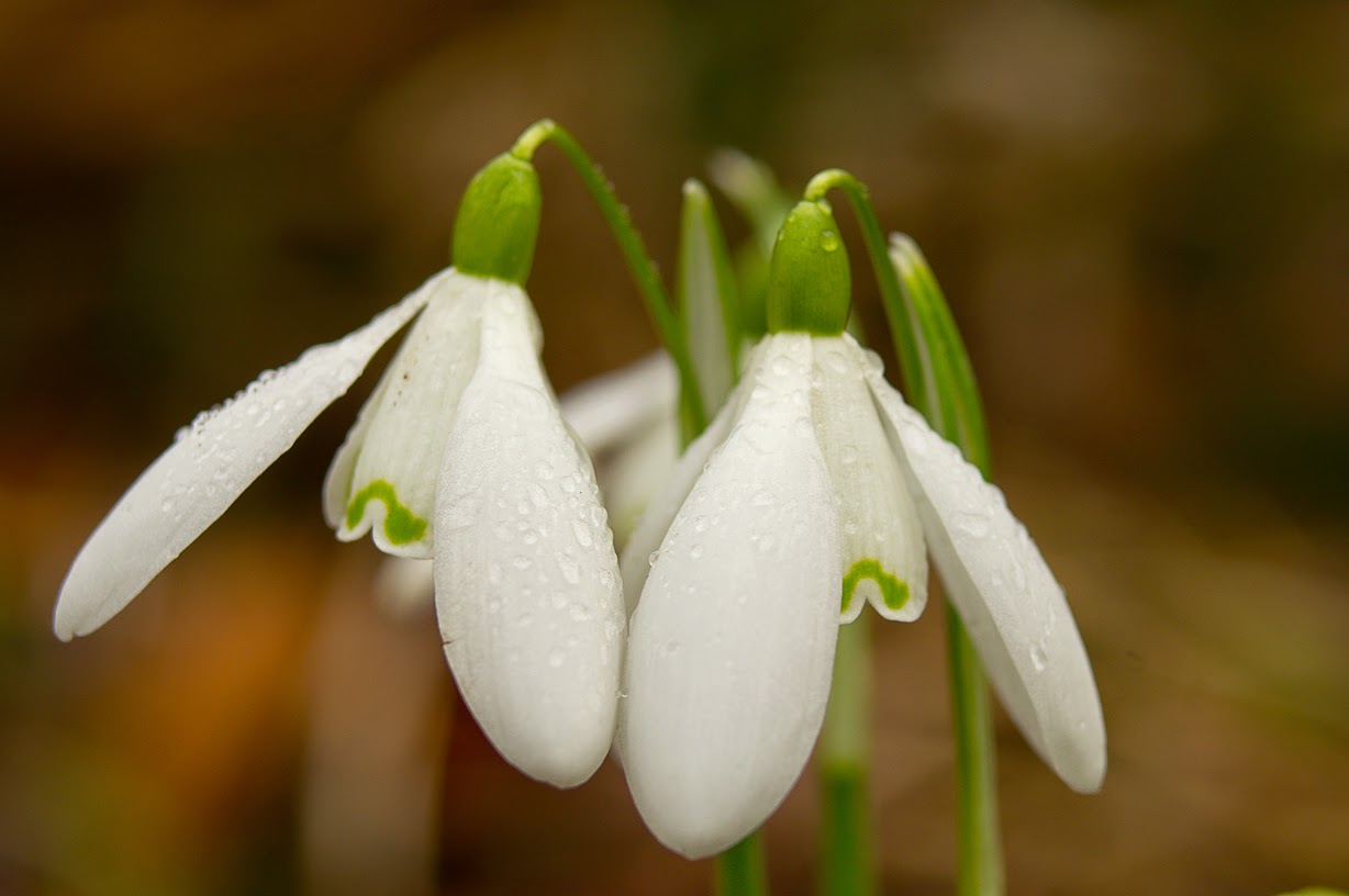
This came about recently when my local photography society  organised a walk to take photos of the snowdrops growing locally.

It is quite liberating to go with a single purpose and have no pressure on you to achieve results. It means you can experiment to your hearts content and see what works and what doesn't.

It also benefits having other photographers with you since it allows you to feed of there ideas and hopefully try them out.

I won't pretend the results of the trip produced anything stunning. This was after all an experimental session. But it means that I have learnt a little more.

Things I learnt.

Macro photography outside is hard, especially on plants with little contrast like snowdrops. I spent  a long time trying to get a good close shot. However  even small amounts of wind caused movement.


This shows how strong a green colour cast can be. Green is a very strong colour


Foliage produces a lot of green colour casts which is especially strong on a white flower like a snow drop. This is the 1st time I played around with photo filters in photoshop to try and remove it


Generally it was a dull day. Actually this is OK for this sort of photography. However for a brief instant the sun did come out allowing some back lighting. What I would like to try next time is put a flash on a long lead and back light it using that

This was probably the best group shot. You could argue the background could be more blurred, but it does provide context.


 I tried the technique of zooming out, while taking this. It worked reasonable well and worth having another go sometime.


Getting low down works well but you need to keep anything above the flowers to a minimum 


I tried some long exposure photos. I wanted to capture movement. Unfortunately there was not enough wind to make it work. Next time I will take something like a reflector or a piece of card to artificially generate a breeze.


After a while you get bored of photographing plants and start taking photographs of your fellow photographers


The other thing to look out for is other locations. This site had some great dark limestone pits which due to their position of quite still. A place to revisit in Autumn when the leaves are yellow.


Saturday, 7 March 2015

Four of the best

The recent competition at my local photographic society was a new format for me. It was called the panel of 4 and required you to present a DPI and/or print consisting of 4 photos in some way connected.

This is actually a lot harder than it sounds. Firstly there needs to be some link between the photos. Secondly each photo has to stand on it's own merits. At the same time each of the 4 photos had to be consistent in terms of both quality and presentation. For example 4 photos, one of which is outstanding, and 3 which are of lesser quality would not work. The great one photo would look out of place from the other 3 and distract from the overall montage.

I must admit I had been thinking about this competition for a while. My original plan for to present a DPI with a panel in 4 strips consisting of various forest trees cropped at tree trunk level. The rebel in me did not like the square  format and I sorely wanted to try something different. However in the end I could not find the type of forest so I had to resort to plan  B.

My 2nd idea was my set of leaf prints taken on my light table. Originally this was going to be my DPI entry, but once I got the prints they seemed to work better that way. The biggest challenge was choosing four. I had intended to show some sort of progression, from fall to decay. But when I tried this, it just looked dis-jointed so I stuck with just 4 light table images.

The print's were originally going to be called Wind, Steam and Power and consist of pictures of wind farms and Ratcliffe power station. The problem was when I put them together the wind farm pictures were just too good and I couldn't find a link between them. So instead it became just pictures of the Ratcliffe power station.

The problem was then to find 4 photos to put in a panel. I found 3 easily,  but the 4th was more difficult. Eventually I used one of Ratcliffe at sunset, and in hindsight I realise this was probaly a mistake, since it was quickly spotted by the judge as the weak link and probably stopped it getting higher marks.

My DPI. The image at the top left was the weakest of the 4. 


The leaves did better, but the judge again took a dislike of one of the panels. Ironocally it was the one I thought it was the strongest of the four.

My leaf prints. Ironically it was the one in the bottom left the judge did not like. I thought it was the strongest


Both panels got 17 marks and again did not make final selection. Once again so close but so far. It has to be said that in terms of the competition, the prints quality was very high, but with a better selection for the DPI's I think I could of done better.

It was interesting to see which ones did do well however. Picking out details say of architecture or single shots of a type of car seemed to work quite well in this format, and sometimes the overall result is greater than the sum or the original photos.

So my takeaway from this sort of competition is as follows:-


  • It is not the overall quality of the individual prints that matter, but the montage as a whole 
  • You need 4 consistent prints, not 3 plus one thrown in for luck
  • Photos of small details work well. The winning DPI was of Moroccan windows. Not great photos individually, but stacked in a panel the sum was greater than the individual
  • With prints, they need to be the same size and mounted the same way. I made the mistake of mounting 2 in black and 2 in white frames. I should of stuck to one colour. Similarly some put prints in of different sizes. This can work well in DPI, but prints just look disjointed.
  • In this sort of competition format, it is best to go out looking for 4 such photos rather than throwing together 4 individual ones you had just taken.
  • The montage must hang together as one photo as well as 4 individual ones.
Still it is an interesting experience, and one worth playing with and pursuing in future years.


Saturday, 21 February 2015

Wedding Photography Blues


My family and I recently went to a wedding reception for my wife's cousin wife. I have found recently that I have reached the stage in life where I am more likely to go to a funeral than a wedding,  so it was a nice change, and of course it goes without saying that weddings are a lot more fun to take photos of.

As someone who enjoys most types of photography, weddings raise a bit of a dilemma. Obviously you want to take your camera, but you also don't want to get in the way of the official photographer and be a pain to the bride and groom.

Most importantly I don't want to make the official photographers job any harder than it already is. I always have a lot of respect and sympathy for professionals doing difficult jobs like this and I am sure they find amateurs like me, even ones that are invited guests a right pain. The last thing I want is for me to make their job any harder than it already is. Anyway it is always instructive to watch the photographers at work.

So I try and compromise and take photo's of areas the official photographer tend to miss. I remember from my own wedding (even though it was many years ago), how much you miss of what is going on. I try and take photos in situations the professional is not going to see such as activities of the guests and give them to the happy couple as a thank you. At the same time of course it gives you a chance to practice your hobby.

In terms of good photo opportunities this wedding was a cracker. The bride was Tunisian/French, the groom English and to cap it off one of the relatives was a top notch bagpipe player. So we had a unique mix of Arabic/French/English disco, the hokey cokey, and the gay Gordons on the bag pipes. To cap it off, we also had belly dancing. If you can't get at least one good photo out of that, give up now!

However taking photos at night in a disco was always going to be challenging photographically speaking. In fact it is difficult to think of more difficult lighting conditions. plus we had a situation  with lots of movement (i.e dancing), a hand held camera with limited angles. You soon start to see why wedding photographers get paid so much, or why they carry the kit they do.

So how do we get some decent photos in conditions like this? Well we have a number of options

1. Use a Flash
2. Use the fastest lens possible and keep the aperture wide open
3. Crank the ISO up
4. Embrace the moment

1. Flash

Let me say first off that I don't like to use flashes. One of the reason I bought a DSLR's was because of its ability to take better images in the poor light and to reduce the number of times I had to resort to flash. I dislike the way flashes flatten the scene(darkening the background). I also find they can be very obtrusive when used at public events.

I do have a quite a powerful all singing/dancing flash which allows me to do things like bounce the light off the ceiling, but due Sony's unique hot-shoe design, I can only use it in manual mode which makes life even more challenging. After a while you realize that using such a flash is as much an art form as using the camera .While this may be possible in a studio, where you control, lighting,etc; at a live event with people moving around all the time it is a hit and miss affair

 Of course there is always the camera's own flash, but this is less powerful cannot be tilted to do things like bounce it off the ceiling.

I must admit using flash is probably something I should learn more about.

One of the things I recently find out was that when you use a flash in a dark room, the shutter speed makes little difference, since the period of the flash defines the exposure time. Then there is the flash sync time, which is basically the shortest shutter speed that you can use your flash with. Any faster and the sensor is not fully exposed and part of your image will be obscured by the shutter. Then there is front and rear curtain sync, which are too complex to go into here, but can make a difference if you want to capture objects moving across the plane of the lens with the flash.

2. Use the fastest lens possible and keep the aperture wide open

I took the my fastest lens I have with me which is my  F2.0 50mm prime. But even with this cranked to its maximum aperture, I my shutter speed was still between 1/10 and 1/30 a second, which was really too slow for hand held (Even with the camera at maximum ISO). Not only that, but it meant the I got a very narrow depth of field meaning you had a only a few people in focus,.

3. Crank the ISO up

As I said in point 2, even with the ISO pushed to my camera's maximum(ISO 3200), I found that I was only getting a shutter speed of 1/10 sec.

Increasing the ISO seems like a get out of free card, but it has its issues. The main one being that the higher the ISO goes, the more noise you will get. Generally at 3200 ISO with my camera, the photos are very noisy and I try not to use it above ISO 400 if I can help it. However sometimes it cannot be helped (top tip, never let your camera choose the ISO for you). While other cameras have a bigger usable ISO range, at some point all will hit this problem.

Saying that, this is one of those situations when I wished I had a Sony A7S and I am surprised more wedding photographers don't have one for these sort of events. It also emphasizes the point that camera manufacturers should really concentrate more on overall noise reduction and light sensitivity rather than stuffing in more pixels onto a sensor

One way around the noise issue is to process them via photo manipulation packages such as Lightroom. These have noise reduction features in their RAW conversions. I tend to use ZonePhoto and generally have ignored these settings, since I try to use the low ISO settings when possible where noise is not a great issue. (Noise processing can also greatly extend your RAW processing times)

However in this case I used the feature quite  aggressively and I was quite impressed with the improvements.  OK, it did not produce exhibition quality photos since they did introduce some softening in the image, but they made a very noisy mess into something far more acceptable

4. Embrace the moment.

OK. So the rooms dark, with flashing lights, your lens is too slow and cranking the ISO produces an image that looks like it has been sprinkled with 100's and 1000's and you don't want to use the flash

 So what do you do about it?

Well once answer is become more creative about the shots you take.

With the movement of a disco, by using the slow shutter speed we can blur the subjects and capture some of the energy and motion at the event. I also tried my wide angle zoom at its widest setting  (10 mm) to take the entire room in, which worked quite well.

It is in these sort of situations where your skills and experience can come to the fore in making the best of a difficult situation. OK, they will not always work, but sometimes you get some interesting shots


In these situations you take the light where you can get it


In moderation the in built flash works well. No way could I got this shot otherwise

I try and look for angles that the professionals won't try. Like adding context by including other guests


The belly dancer (I think it wsa the brides sister) was excellent, but without using flash there was no way to get a good picture of her. But the slower shutter speed shows the dynamism of the dance 

Again slow shutter speed adds a surreal quality


I wasn't sure how a wide angle would work, but actually I quite liked the effect


Saturday, 31 January 2015

Getting back on the bike

I'm sure all artists suffer from days when they wonder what the hell they are doing. None of the things they try turn out as they want, they lack inspiration and the reaction of other people to their work ranges from at best lukewarm , through "meh" to just downright hate.

I have to admit I've been going through one of those phases recently.

My entries to photo competitions have garnered far fewer marks than I expected. When I have gone out and taken photos, I have not managed to get the quality and results I want. I reached the point where I wonder whether I was kidding myself that I had any ability at all in photography and perhaps I should just give up and take up a new hobby like basket weaving. (Please note I am not comparing myself here with a real artist, just anyone with artistic pretensions)

It is also very easy to start comparing yourself with others, and feel you will never get to their level. Recently we had a talk at the local photo club  from someone who had just achieved their CPAGB qualification. This is the first time I had heard of this and it was fascinating to learn about the judging process, which is a akin to a photographic competition on steroids. The best analogy I can think off is having to present your photos while standing in front of the judges stark naked.

Anyway ,with that image in your heads, the process requires you to present 10 photos and 6 judges mark them from 2 to 5 (why 2? - Ed.) and you need to garner an average mark of 20 marks per photo to achieve the CPAGB qualification (this is just the 1st level, there are other levels that can be obtained).

The scary thing was that despite this persons photographs being excellent and often winning or getting close to the top in internal club competitions, in the CPAGB judging they only just scraped enough marks to get a CPAGB award.

This made me realise the huge gulf between me and even the lowest level of professional photography.

Anyway I decided I needed to take a step back and have rethink and review of my photography. Was there anything I could do differently? How could I improve my level? Am I kidding myself about my ability?

I think in these situations it is also important to not let despondency get the better of you and actually get out and take some photos.

This is what I did.

And this was the result.


This was taken on the way to work, on a particular cold and frosty morning at a local windfarm. I must admit it has been heavily processed, by doing a HDR conversion on the ground, but the sky is pretty close to the original.

I am really happy with it, and seems to been reasonably received on 500px which is never a bad sign.

Anyway as a result, I feeling a little better about my photos. As the old adage says, if you fall of your bike, you need to get straight back on.


Friday, 23 January 2015

A wider viewpoint

Readers of this blog know that one of my targets in life is to do photography on a budget. So recently I did something very out of character and actually spent a considerable amount of money on a new lens.

Now we need to put this into context. To some a "considerable" amount of money is anything over £1000. The photo blogs are full of individuals who seem quite happy to buy the latest camera bodies plus the lenses to go with them, seemingly money being no object.  However for me anything over £100 seems a wasteful extravagance.

However recently I have been aware of gaps in my lens collection. Specifically at the low and high ends of the focal range. As I was perusing e-bay (always dangerous waters to travel), I noticed a Tamron SP AF 10-24 mm f/3.5-4.5 for sale. So I put a bid in, in the belief (hope) that I had no chance of winning.

I was therefore quite surprised when my bid was the highest.

So for the princely sum of £200 I find I had added a wide angle zoom to add to my lens collection. Now to me £200 seems a lot, but it is slightly mollified (so I to tell myself [and my wife]) that it is roughly half the price of what I would need to pay for it, if I bought it new.

Once I finally got my hands on it, I realized I hadn't got a clue what I was going to do with it. So as with all new toys I started playing with it.

The 1st surprise was how far everything seemed away. Being used to my superzoom 28-210, I had grown accustomed to framing everything using the lens. However you couldn't do that with this. In truth the difference between 10 and 24 mm is quite small, and you do wonder whether a 10mm prime would be just as useful, without the zoom complexity.

The next problem was the size if the  lens. Most of my filters are 62mm, This is 77mm and I found to my dismay I didn't even have a cokin adaptor ring for that size of lens and my filter stepper set stopped at one size to small. So now I am faced with the dilemma of whether to buy a set of 77mm filters.

In hindsight it would made more sense to buy all my filters at 77mm and fit them via an stepper adapter,  but that would of increased the cost. Alternatively I could of invested in a Cokin type system, but they are so bulky. In the end I got around the problem by attaching two plastic cokin type ND filters to the lens and camera through the use of two elastic band.

Anyway below are some examples of my first attempts with my new toy...


Wide Angles close up tend to distort features. However this is not always a bad thing and can produce some intetresting effects especially in portraiture 


A typical wide angle landscape shot. The main issue with a wide angle seems to be the need to have lead in lines. Fortunately the sun being behind me allowed shadows to fulfill that function including one of me

Close up of architecture can suffer from converging lines, and wide angles are especially susceptible to that. However it can also be used to create interesting surreal effects.  

Again some distortion, but the wide angle means I can get the whole church in


Again playing with distortion, the towers lend themselves to converging lines by emphasizing there size. This was taken with my jury rigged filter modification.

This is where wide-angles come into there own by allowing the camera to take in far more of a landscape.


Wednesday, 14 January 2015

The results are in....

As I mentioned here, recently we had the Tom Tivey competition for Natural History and Landscape at the Melbourne photographic society.

Most photographers at some point will have a go at landscape and/or natural history subjects. As a result the competition standard was very high, with some excellent photos on show.

Of course, as with any competition, one of the most important factors is the judge and last nights judge was excellent. Often judges only concentrate on the imperfections in the image, but this judge generally only provided positive comments and gave some good advice as he did so. I thought he made a potentially stressful evening, quite enjoyable.

Of course, as with any judge, you will have a difference of opinion in his choices, and I did not always agree with some of his marking. However the overall winner was definitely deserving of the main award.

In theory, judges should be unbiased and base their choice on the artistic and technical merit of the photo. There is a marking scheme that they should follow. But judges are human (in the most part :) ), and as swayed as much as anyone by there own experiences, and prejudices. One consequence is that they tend to concentrate on the technical aspects and avoid artistic merits (which are harder to judge). However as a result, I was aware that sometimes the judge and my own photo philosophy perhaps did not entirely mesh.

For example, when I take a photo of a wild animal, I think it is important that you put it in the context of it's natural environment. This judge however seemed less bothered by this.

So saying all that, how did my entries do, and what did I gain from the experience?

Well, if the  truth be told , I was a disappointed with my marks. My prints all got 16 each, which sounds like  good results, but were in fact a average mark(You are really looking for 17 and above). My DPI's scored 14, 15, 16 out of 20. Again this sounds good, but it was clear last night that the judge was only scoring between 14 and 20, so 14 was in fact a low score.

But was the judge right to mark as he did?

To decide I have gone back to some of the photos and changed them based on his comments. I have then compared them to see if the results are significantly improved.

Exhibit 1


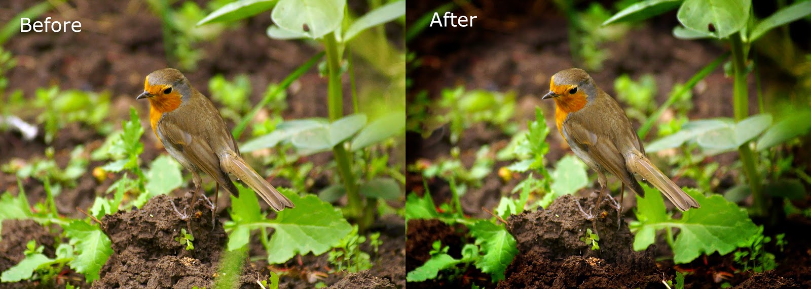
This photo scored 15. The judges main issues was the white blob on the left side of the photo (actually on the big screen the green area in the bottom center caught my eye more).

However is biggest issue (and this was mentioned a number of times) was the lack of catch light in the Robin's eyes. He suggested adding a artificial catch light to lift up the eye and provide more of a focal point.

I must admit this is something I have done in the past (I would prefer that it was in there naturally, but animals are rarely that obliging). It sounds like a good idea and the effect can be good when done well.

However here is the issue. Doing it well is not that easy. You can not just add a blob of white on the eye. It has to look natural, and that means it has to be consistent with the lighting.

The easiest way of achieving this is to enhance a natural reflection in the eye. In the case of the Robin, there is one, but it is small and enhancing it actually does not make a huge amount of difference.

The other big change, apart from removing some of the more glaring artifacts, is that I have added a vignette to the photo. I am in two minds about this. OK, it helps concentrate the eye on the subject, but it also removes some of the natural element of the photo.

So do I think the advice improves the photo?

Well I give the advice a strong  8/10.

I think it does make it better, but in truth maybe it wasn't the best photo to enter in the 1st place

Exhibit 2


This one was originally given  16 marks.

His main complaint was that it would of been better with the subject and reflection central rather than further down.

He may be possibly right, but I really wanted to show the Avocet in it's natural surroundings and to do that I wanted as much space around as possible. This is one situation where a vignette probably degrades rather than enhances the image.

So 5/10

Exhibit 3


This one garnered 15, which I thought was under-marked. 

His suggestion was that it should be closely cropped and the bird moved to one of the thirds composition lines. 

I must admit I had my doubts, but after trying it, I think he was right and it make a more effective photo without removing the natural history element. 

So for this one 9/10

Exhibit 4


This one was given 14, which I think was severely under-marked. OK, I knew at the time that this was a risky entry, but it is one of the photo's which I feel the judge missed what I was trying to achieve.

It is titled "Murmration" and it is a picture of Starlings as they flock before roosting. Now the judges comment was that it would of been better if it had been the picture had been of the shapes of the Starling as they clump and move.

Here I disagree.

What I was trying to show was the speed and movement of the Starlings. Zooming out and showing them as dots, then they would just of been dots. (Maybe it would of been better if I had called it "flocking Starlings")

This way we can see them as Starlings. Now It could be argued that the powerlines distract from the image. My feeling is that it is marginal, and could even provide visual interest in the background. My only concession is that maybe cloning out the upper power line is a slight improvement.

Nor do I think that cropping closer, as suggested, helps in any meaningful way.

So here I have to give 2/10

Summary 

In hindsight it is obvious that maybe some of the photos could of been improved by better cropping or more visual processing. Also I perhaps entered the wrong photo. Vignette is not a technique I greatly use, but perhaps I should think about more in the future.

On the other hand, sometimes you just have to believe in yourself and work to what you feel is right and hope the rest of the world catches up. Is that pompous? Maybe, but if we don't do this, we will just continue to trail others, rather than setting our own path.